Redesigned Navigation Hierarchy and page layout to enhance Information Wayfinding
Streamlining Access for Seneca Website
With the growing number of students choosing Canada for nursing studies, the current Seneca Nanji Foundation website does not adequately meet their unique needs in terms of information architecture and content. Consequently, a redesign of the original site has been initiated to better serve this demographic.
Project Type
UX Design, User Research, Web Design
Team Member
Team Member
Xiaoping Shang, Baoting Han, Miniraj Singh
My Role
UX Researcher, UX Desinger
Duration of Completion
6 weeks

© 2025 Seneca Nanji Foundation School of Nursing. All Rights Reserved.
Problem
Stakeholders from Seneca have reported that students struggle to find information on the website, leading to increased support calls from student seeking guidance on navigating the site. Stakeholders requested a website redesign to recognize the site structure. However, there is little data about what exactly causing this problem.
To enhance our competitiveness in the current market and attract a greater number of new students while retaining our existing ones, our focus is to streamline the website's user flow, offer comprehensive services tailored to the diverse needs of our international student population, and ultimately strengthen our position in the educational sector.
About the Project
In this project, I will demonstrate how I helped stakeholders identify the root cause of the problem through user research and heuristic evaluation, I will explain how I reframed the project direction and proposed solutions that required minimal development effort.

Object
What I Fixed
Improve site architecture and navigation to enable easier browsing and a more frictionless experience
Implement supplementary Service navigation options for improved content discovery
Fast Link integration for faster access to essential services
Breadcomp Intergration allowing user easily switch back and forth without forgetting where they have been previosly.
What I Achieved
TASK COMPLETION TIME PERFORMENCE
-16%
FIRST 3 MONTHS POST LUNCH
SUCCESS RATE
+26%
FIRST 3 MONTHS POST LUNCH
STUDETN SATIFICATION
+13%
FIRST 3 MONTHS POST LUNCH
RESEARCH
What We know
Our Student Service Foundation Complaint Input Management system has helped us pinpoint several recurring issues reported by current students at Nanji Foundation School. During the project's initial phase, we interviewed and surveyed more than 100 participants to gather insights into their experiences and challenges. This process allowed us to gain a clearer understanding of the problems they encounter, the services they utilize most often, and their primary goals when interacting with the website. In general, students find the website experience too complicated.
The Current Webiste experience is too complicated and students have struggle with the current use of website
Many User Complained...
Many Complained They have hard time navigating through different pages
Users find it difficult to navigate the website due to its unclear layout and lack of organized paths, making it frustrating and time-consuming to find necessary academic resources.
Lack of Support for International Transitions :
The website does not provide clear guidance or resources for international students adjusting to life in Canada. Without adequate support, students may feel lost or overwhelmed, making it difficult for them to settle into both their academic and social environments.
Hardtime Locating essential services
Key services, such as academic advising and transportation information, are hard to find because they are not prominently featured or easily accessible on the site.
Stakeholder's Voice
To grasp our constraints and school goals, we interviewed the school board, which is the Head of Faculty, several program coordinators, and the Head of Technology. To balance the need between School Board and Our end-users, we were told the following:
Retain the service site we had
Retain
As Seneca is Already equipped with many service portals, for example, "Libary", "Student Service", and Especially My.Seneca" and more.
Seneca website as information site
Revise
Our school already provides a backend student portal called 'MySeneca,' that enables students to manage school services. Instead of Replacing and designing new portal, the goal is to identify quick wins and solve the problems with minimal development effort
Process Into Solution
To pinpoint the opportunity and align with our goal, we undertook the following steps.
Define Target User Group
Before taking down and analysis the problem with the exisiting website, we first reach out to identify our main users of this website.
Below are the two main target user groups and their key goals. I have highlighted the services and information that need to be easily discoverable for both groups.
Applicant
MUHAMUD

For people like Muhamud, the prioty is to locate essential sources / services before he commites any enrollment.
Existing Students
EMILY

For Students like Emily, her goal is to locate the essential services and prepare for her graudation and career opportunities
In the Design Phase, we need to put the following services entry points in consideration:
Usability Testing Report
To gain deeper insights into how users navigate the menu, understand their mental models when reading and interpreting information organization, and identify what confuses them during this process, we conducted usability testing where participants completed several information finding tasks. The result demonstrated the following:


Evaluation Phase
The primary issues with the Seneca Nanji Foundation Nursing Faculty website appear to stem from a disconnection between the site's information architecture and the users' mental models. This misalignment manifests in several key areas:
We noticed the following problems with the existing site
01
Violation #8
Aesthetic & Minimalist Design
The current site structure doesn't align with students' expectations, leading to inefficient navigation and frustration. For example, grouping "Financial Supports & Helpful Resources" with many other items makes it difficult for students to find specific financial aid information.
03
Violation #3
Matching between the system and the real world
Pages contain excessive text and poorly organized information, making it difficult for students to quickly find what they need. For instance, financial aid information is scattered and not intuitively labeled.
02
Violation #1
Visibility of System Status
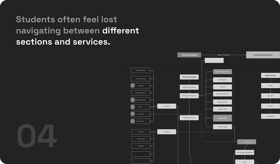
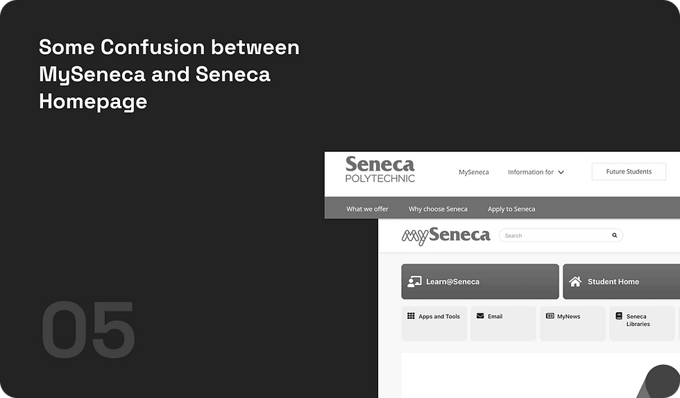
Students often feel lost when navigating between different sections, especially when moving between the faculty page and the portal. There's a lack of clear breadcrumbs or other wayfinding aids.
04
Violation #4
Recognition rather than recall
Students are unsure when to use the faculty page versus the portal, leading to inefficient task completion. The transition between the two platforms is not seamless, causing disorientation.
Insight
Following a comprehensive series of usability tests, heuristic evaluations, and additional rounds of surveys, along with participant interviews, we meticulously analyzed the findings to identify key issues.
Major Issues
Breadcrumbs navigation does not serve the functions that aids to help people navigate within the website.
Many User reported they are lost after landing on spefic pages, which casuing them confusion due to the lack of structured menu level orientation. User did not expect to be navigated to where they are
Issue With Discoverability
There are only 3 vertical levels and only few remain under the second level. However, most essential services are not clear for students to understand and locate when needed.
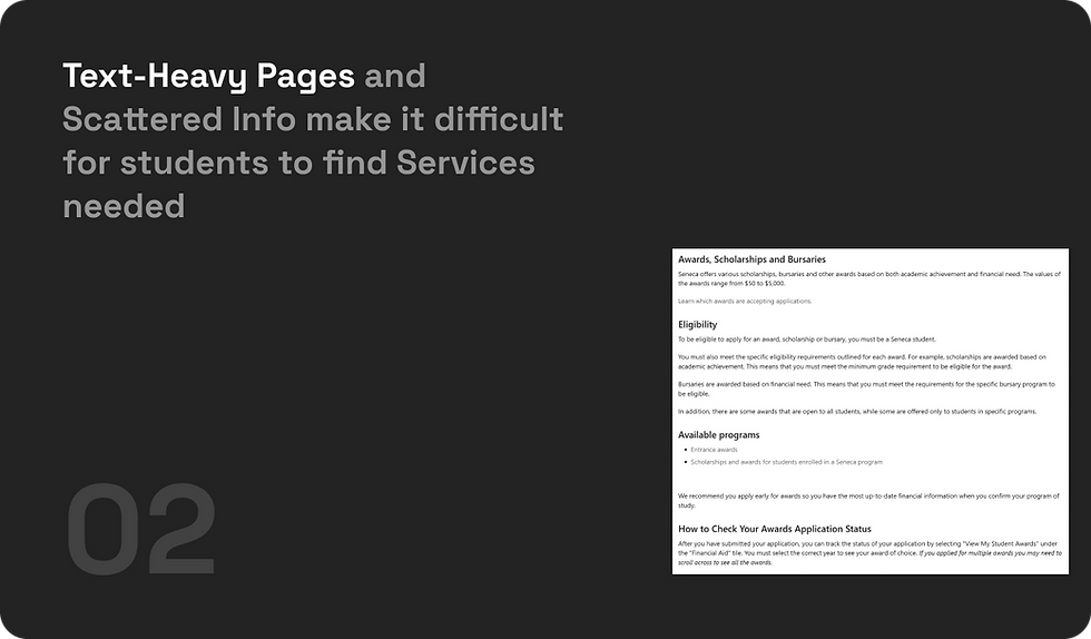
Issue With Content Presentation
As an academic website, it is typical to encounter substantial text-based content. However, specific pages such as "Financial Aid" and "OSAP," designed to provide essential information and act as access points for students applying for financial assistance, often contain an excessive amount of text.
Competitive Analysis
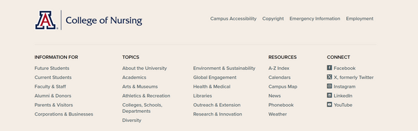
The competitive analysis focused on competitors' accredited university programs. I examined their main menu navigation layouts, labels, grouping, and interactions, as well as their subpage layouts and information hierarchies.
University of Arizona: The Streamlined User Navigation
-
The “I am” call to action (CTA) allows users to choose the group that aligns with their needs and access tailored information to complete their intended actions.
-
Clear Labeling allows students quickly identify information
-
A simple site search tool makes it easy to directly search for specific resources or information.
-
Quick Access to services needed allows user consume less steps to the services needed


University of California San Frasico : Knowing thier audience

How Might We
Make our Website
Discoverable
User will gain extra sense of control with streamlined navigation, and always know where they are.
Organized
Organized Content and layout structrue to streamline the reading and finding experiene
Accessible
Accessible by reducing cognitive Load for user to obsour information
DESIGN STRATEGY

PROTOTYPE
What We Do
After a series of analysis, audition and comparison. We identified the major problems and came up with the series of solutions.
Solution Overview
What the new update will feature:
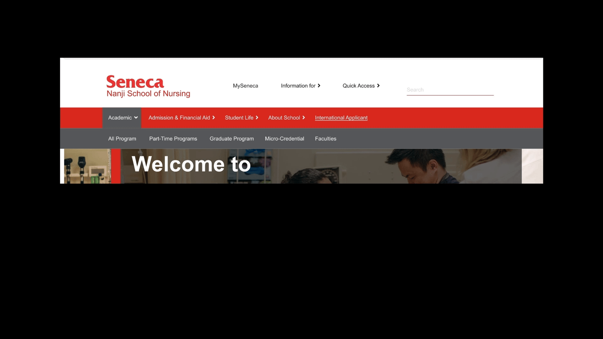
An new updated, more user centric and categorized Nagivation menus.
Improved Wayfinding via revised breadcrums, secondary navigation on heavycontent based pages like "Finical Aid"
Reorganzied Text Heavy content with clear chunks seprations, collapisbed text, along side a CTA button allowing students access to service quickly.
Revampped Welcome Page design serves as a home hub for most needed services, and the redesigned layout matching user's academic journey expctation.
Updated Unrelevent URL, Personalized workshop events system with filter.
Streamlined Navigation with Clear labeling and Segments
While the exsiting site structure being scattered, duplicated, misaligned, unclear. We start to work for a revision that allowing the labels matching students' expectation through card sorting
Before: Menu labels are unclear and overlapped.
Along with the menu deconstruction from the existing site using UX guideline checklist, We found that The Seneca webpage suffers from overlapping content (e.g., "Student Support," "Fees & Expenses," "Student Services"), unclear labeling (e.g., "Real-World Experience"), and confusing segmentation, especially for international students. While overly focused on program details, it neglects key student concerns, such as learning methods, costs, financial aid, and job placement prospects, making navigation cluttered and less student-focused.
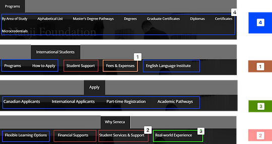

Solution: A Revamped Information Arcetecrtuer redeisgn
The existing site structure is characterized by scattering, duplication, misalignment, and lack of clarity. We are undertaking a revision process aimed at aligning the with students' expectations through card sorting. By identifying the students' mental model, we will reconstruct the navigation to enhance clarity and usability
Improved Wayfinding via revised breadcrums, secondary navigation on the side
After a series of analysis, audition and comparison. We identity the major problems and come up with the series of solutions.
Before: Information content is scattered and heavy text based
Students often feel overwhelmed when the OSAP information page under Financial Aid Categories. The dense text format requires significant cognitive effort to read through, making it challenging for students to begin the application process. Additionally, the "Apply" call-to-action is not prominent enough, as it is only the size of its text.
Students often feel confused because there's no clear indication their location within the site or where to find specific OSAP information. After clicking through various sections in the menu, they may discover that this information is actually categorized under Paying for Your Studies. Additionally, many students are unaware of how the content relates to the navigation above it.

Solution: Improve Wayfinding and Assurance Through Side Navigation and Prinicple of Proxmity.
While The exsiting Site Structure being Scattered, Duplicated, Misaligned, Unclear. We start to work for a revision that allowing the labels matching students' Expectation through Card sorting
With Side Navigation Menu added to the page's right-bottom, users will also clearly understand the site they are on.
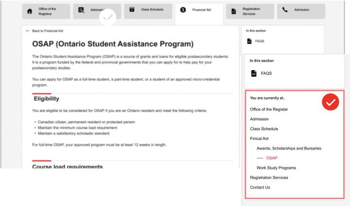
Revised Use of labeling "Finical Aid" allowing students to be consistent with the mental model, knowing their landing. Additionally, a small UI improvising following promixty, allowing user viewing OSAP information page as part of Finical Aid Menu.
_edited.png)
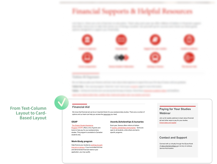
The text content has been revised to include clear labeling that differentiates between titles, text materials, and various sections of information. To enhance user experience and reduce cognitive overload, a collapsible text feature has been implemented, allowing students to efficiently navigate to their desired content. Additionally, a call-to-action button labeled "Apply Now" been incorporated at the conclusion.


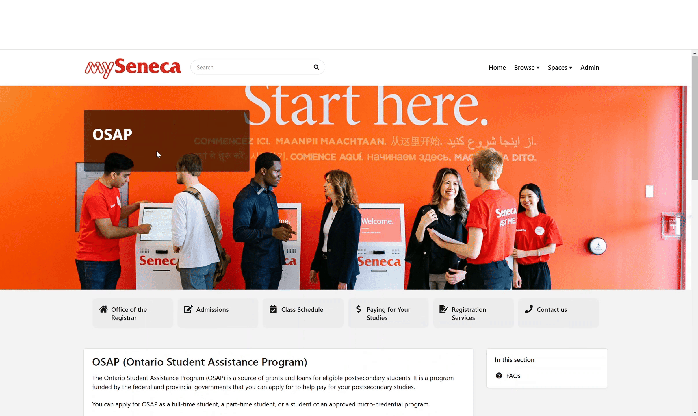
A New "Home" Experience
"The updated welcoming pages provide the Nan Foundation with expedited access to the services they require, directly their homepage."
After a series of analysis, audition and comparison. We identity the major problems and come up with the series of solutions.
The Quick Access link positioned directly below the Hero Image has been identified through our survey and as the most frequently utilized service. By implementing this quick link, students will have streamlined access to services they require.

.png)

A NEW LOOK
.png)
© 2025 Seneca Nanji Foundation School of Nursing. All Rights Reserved.
End Result
Student Success Rate
+26%
FIRST 3 MONTHS POST LUNCH
For Sites like "Fincial Aid" and "OSAP" page, Many students experienced confusion and eventually gave up continuing the test, while for other students struggle to locate information and service, Our revision made an significant improve,ent
User Satification
Rated 5
That is +13% Increase
After the launch, we couldn't wait to hear our students, so we sent out a survey for their feedback! The response was fantastic—many of them absolutely loved the new design, raving about its stunning aesthetics and engaging interactivity!
Task Completion Time
-16%
FIRST 3 MONTHS POST LUNCH
After the launch, we’re excited to invite back our previous participants along with some new faces to join us usability testing, and the results have been absolutely fantastic